Are you taking the DIY route for your Elementor website? Let’s level up your generic template with a background gradient animation.
In this post, I’ll walk you through an effective way to enhance your Elementor website by adding a background gradient animation using CSS.
The best part? It can be done with both the free and Pro versions of Elementor.
For this demonstration, I’m using the Free Elementor Plugin with the Hello theme.

What is CSS?
CSS, or Cascading Style Sheets, acts like the design blueprint for your website. It allows you to customize the appearance of elements, like buttons, by defining their colors, sizes, and animations.
In our case, we’re using CSS to style containers in a flex box, specifying size, background gradients, transformations, and timings.
Key Aspects of CSS:
1. Selectors are patterns that match elements on an HTML page. They allow you to pinpoint which elements you want to style.
2. CSS properties define the specific styling aspects you want to change, such as color, font size, margin, padding, etc.
3. Values are assigned to properties, determining how the styling should be applied. For example, a color property could have a value like “blue” or “#3498db.”
4. CSS syntax follows a straightforward pattern. Each styling rule consists of a selector, a declaration block enclosed in curly braces, and within the block, property-value pairs separated by colons and terminated with semicolons.
If you want to learn more about CSS, W3Schools is a great place to start.
How to Add a Background Gradient Animation with CSS in Elementor
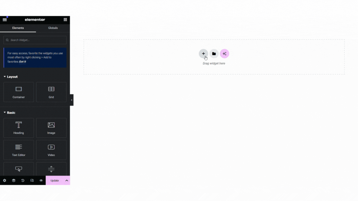
Step 1: Add a flexbox to your canvas and give it some basic styling
- In the Elementor canvas, add a new flexbox with 4 containers.
- In the layout tab, change the content width from boxed to full width.
- Select the first container and navigate to the Advanced tab.
- Scroll down to the CSS Classes box and add ‘circles yellow’
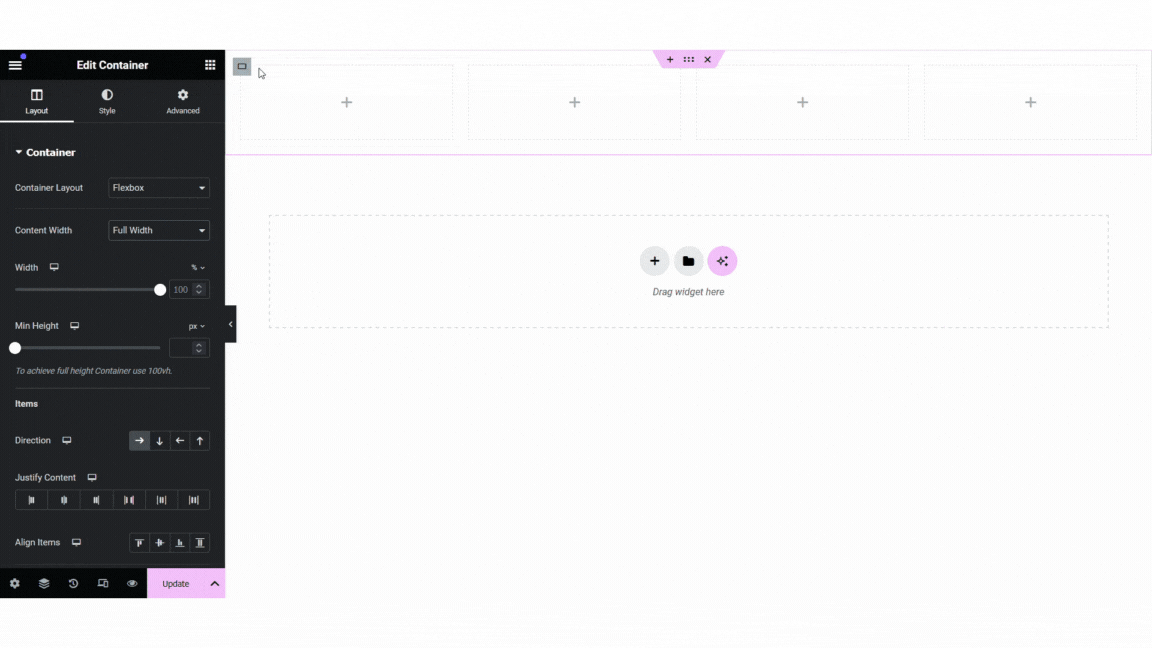
- Repeat step 4 for each of the other containers but change the color from ‘yellow’ to ‘orange’, ‘pink’, and ‘cyan’.
- Save your draft.
Now let’s write our code.
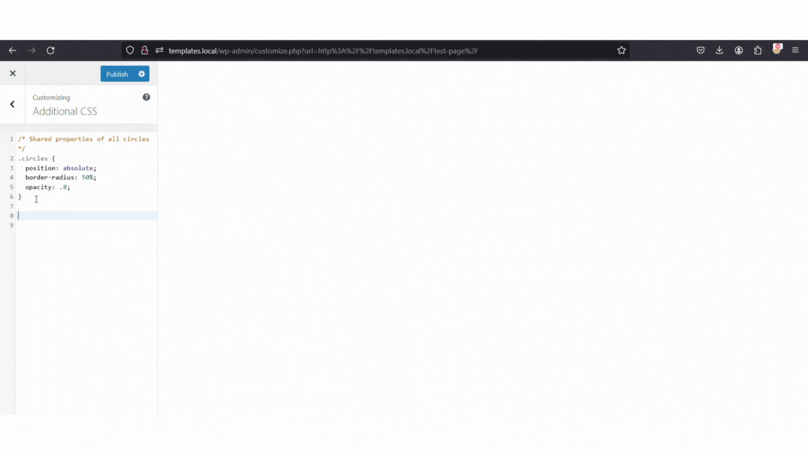
Step 2: Create the circles using CSS in the WordPress customizer
In WP customizer navigate to ‘Additional CSS’.
1. Create the properties that all the circles share.
- Set the selector: .circles {}
- Inside the curly brackets set the following properties: position, border-radius, transform, and opacity.
/* Shared properties of all circles */
.circles {
  position: absolute;
  border-radius: 50%;
  opacity: .8;
}
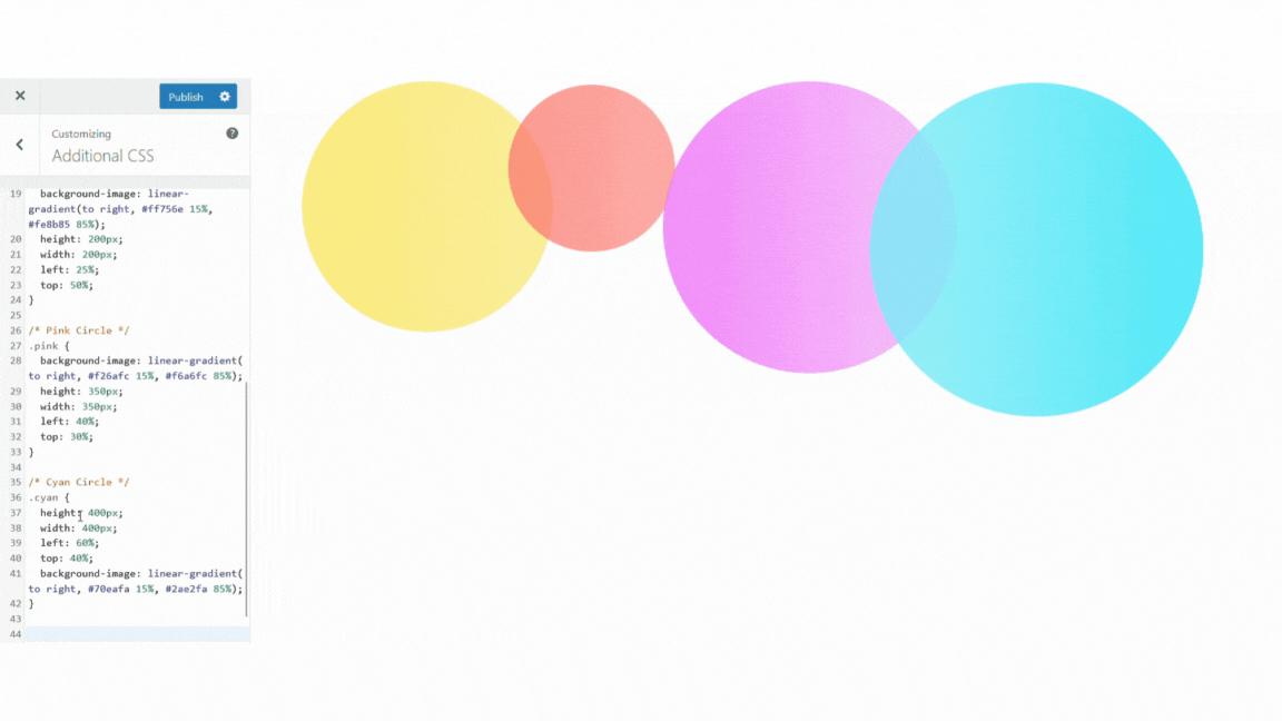
2. Create the yellow circle.
- Set the selector .yellow {}
- Inside the curly brackets set the following properties: background-image, height, width, left, and top.
/* Yellow Circle */
.yellow {
  background-image: linear-gradient(to right, #fce658 15%, #fce973 85%);
  height: 300px;
  width: 300px;
  left: 5%;
  top: 30%;
}
3. Repeat step 2 for each of the other colors.
/* Orange Circle */
.orange {
  background-image: linear-gradient(to right, #ff756e 15%, #fe8b85 85%);
  height: 200px;
  width: 200px;
  left: 25%;
  top: 50%;
}
/* Pink Circle */
.pink {
background-image: linear-gradient( to right, #f26afc 15%, #f6a6fc 85%);
height: 350px;
width: 350px;
left: 40%;
top: 30%;
}/* Cyan Circle */
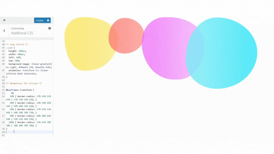
.cyan {
height: 400px;
width: 400px;
left: 60%;
top: 40%;
background-image: linear-gradient( to right, #70eafa 15%, #2ae2fa 85%);
}
Step 3: Add the animations with keyframes
Add some keyframe animations to make the circles move. We are adding two different animations: transform and movement.
Learn more about keyframes here.
Transform Animation
1. Create the transform keyframe animation.
- Set the property @keyframes transform {}.
- Inside the curly brackets set the sequence and border-radius selector.
/* Animations for Circles */

@keyframes transform {
    0%
   20% { border-radius: 37% 63% 51% 49% / 37% 35% 35% 63%; }
   40% { border-radius: 36% 64% 64% 36% / 64% 48% 52% 26%; }
   60% { border-radius: 37% 63% 51% 49% / 30% 30% 70% 73%; }
   80% { border-radius: 40% 60% 42% 58% / 51% 51% 49% 59%; }
  100% { border-radius: 33% 67% 70% 30% / 30% 40% 70% 70%; }
}
This animation sequence uses percentages (0% to 100%). At each part of the sequence, the border-radius changes shape, creating the moving blob appearance.
The border-radius property is used to create rounded corners for an element. The values in each step define the horizontal and vertical radii for each corner individually. The first four values specify the horizontal radius for the top-left, top-right, bottom-right, and bottom-left corners respectively. The next four values (after the slash) specify the vertical radius for each corner in the same order.
2. Add the transform animation timing to each of the circles.
- Inside the curly brackets of each color circle, set the animation property.
- Set different timings for each color so they appear less uniform.
/* Add this to the yellow circle code */
animation: transform 10s linear infinite both alternate;

/* Add this to the orange circle code */
animation: transform 15s linear infinite both alternate;

/* Add this to the pink circle code */
animation: transform 13s linear infinite both alternate;

/* Add this to the cyan circle code */
animation: transform 11s linear infinite both alternate;
Movement Animation
1. Create the movement keyframe animation.
- Set the property @keyframes movement {}.
- Inside the curly brackets set the sequence and transform selector.
@keyframes movement
{
    0%,
  100% { transform: none; }
   50% { transform: translate(50%, 20%) rotateY(10deg) scale(1.25); }
}
At the beginning (0%) and end (100%) of the animation sequence, the transform property is set to none.
This means that the element will have its default transformation applied at these points, effectively keeping it unchanged.
At the halfway point of the animation, 50%, the transform property is set to a combination of transformations:
- translate(50%, 20%): This translates (moves) the element horizontally by 50% of its own width and vertically by 20% of its own height.
- rotateY(10deg): This rotates the element around its Y-axis by 10 degrees. This creates a rotational effect along the vertical axis.
- scale(1.25): This will scale the element to 125% of its original size along both the horizontal and vertical axes.
So, when this animation is applied to our circles, it will start and end with no transformation (transform: none;) and at the halfway point (50%), it will be translated, rotated around the Y-axis, and scaled at 125%.
2. Add the movement animation timing to each of the circles.
- Inside the curly brackets of each of the circles, add the code below to the animation property.
/* Add this to the yellow circle animation property */
, movement 10s linear infinite both;

/* Add this to the orange circle animation property */
, movement 7s linear infinite both;

/* Add this to the pink circle animation property */
, movement 13s linear infinite both;

/* Add this to the cyan circle animation property */
, movement 15s linear infinite both;
Step 4: Add the blur filter to the circles
Next, we need to add the blur filter to the circles.
Learn more about the filter property here.
1. Add the filter property to the ‘.circles’ selector.
/* Add this to the circles selector */
filter: blur(40px);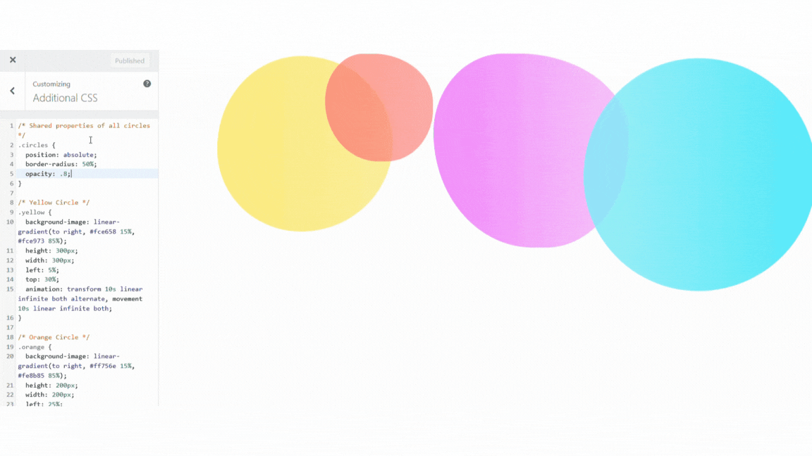
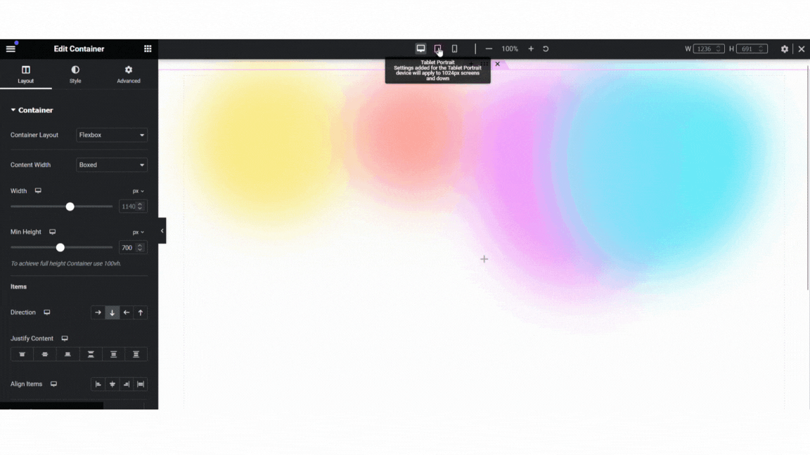
Step 5: Checking our background gradient for mobile responsiveness
Lastly, we need to check our code for mobile responsiveness.
In the Elementor editor, use the tablet and mobile view in Elementor’s responsive settings to check the size and position of the circles. Add media queries for tablet and mobile to fix these issues.
/* Media queries for responsiveness */
@media screen and (max-width: 768px) {

  /* Styles for tablets and smaller devices */
  .yellow {
    left: 0;
    top: 40%;
    height: 200px;
    width: 200px;
  }

  .orange {
    height: 150px;
    width: 150px;
  }

  .pink {
    height: 225px;
    width: 225px;
  }

  .cyan {
    height: 200px;
    width: 200px;
  }
}

@media screen and (max-width: 480px) {
  /* Styles for mobile devices */
  .yellow {
    height: 150px;
    width: 150px;
  }

  .orange {
    height: 100px;
    width: 100px;
  }

  .pink {
    height: 175px;
    width: 175px;
  }

  .cyan {
    height: 150px;
    width: 150px;
  }
}
Step 6: Troubleshooting our background gradient in Elementor
Many problems with Elementor are caused by caching plugins, so first try clearing your cache. If that didn’t fix the issue, try regenerating the CSS and data in the Elementor tools tab.
Next, check your code for syntax errors. This includes missing semicolons, braces, or any other typos that might be causing the problems.
Also, make sure that your CSS selectors are not causing a conflict with other plugins installed on your website. Try changing the selectors, (.circles, .yellow, .orange, etc), to something different.
Final Thoughts
Feel free to use my code as is, or play around with the different properties to create a background that fits your website aesthetic. Experiment with the gradients, adjust the transition speeds, and make it yours!
The beauty of CSS lies in its flexibility, allowing you to level-up your website templates to fit your brand identity.
Remember, if you encounter any challenges or have questions along the way, feel free to drop them in the comments below. I’d love to see your work, and I’m here to help!
Full CSS for Elementor Animated Background Gradient
/*CSS FOR ELEMENTOR*/

/* Shared properties of all circles */
.circles {
  position: absolute;
  border-radius: 50%;
  opacity: .8;
  filter: blur(40px);
}

/* Yellow Circle */
.yellow {
  background-image: linear-gradient(to right, #fce658 15%, #fce973 85%);
  height: 300px;
  width: 300px;
  left: 5%;
  top: 30%;
  animation: transform 10s linear infinite both alternate, movement 10s linear infinite both;
}

/* Orange Circle */
.orange {
  background-image: linear-gradient(to right, #ff756e 15%, #fe8b85 85%);
  height: 200px;
  width: 200px;
  left: 25%;
  top: 50%;
  animation: transform 15s linear infinite both alternate, movement 7s linear infinite both;
}

/* Pink Circle */
.pink {
  background-image: linear-gradient(to right, #f26afc 15%, #f6a6fc 85%);
  height: 350px;
  width: 350px;
  left: 40%;
  top: 30%;
  animation: transform 13s linear infinite both alternate, movement 13s linear infinite both;
}

/* Cyan Circle */
.cyan {
  height: 400px;
  width: 400px;
  left: 60%;
  top: 40%;
  background-image: linear-gradient(to right, #70eafa 15%, #2ae2fa 85%);
  animation: transform 11s linear infinite both alternate, movement 15s linear infinite both;
}

/* Animations for Circles */

@keyframes transform {
    0%
   20% { border-radius: 37% 63% 51% 49% / 37% 35% 35% 63%; }
   40% { border-radius: 36% 64% 64% 36% / 64% 48% 52% 26%; }
   60% { border-radius: 37% 63% 51% 49% / 30% 30% 70% 73%; }
   80% { border-radius: 40% 60% 42% 58% / 51% 51% 49% 59%; }
  100% { border-radius: 33% 67% 70% 30% / 30% 40% 70% 70%; }
}

@keyframes movement
{
    0%,
  100% { transform: none; }
   50% { transform: translate(50%, 20%) rotateY(10deg) scale(1.25); }
}

/* Media queries for responsiveness */
@media screen and (max-width: 768px) {

  /* Styles for tablets and smaller devices */
  .yellow {
    left: 0;
    top: 40%;
    height: 200px;
    width: 200px;
  }

  .orange {
    height: 150px;
    width: 150px;
  }

  .pink {
    height: 225px;
    width: 225px;
  }

  .cyan {
    height: 200px;
    width: 200px;
  }
}

@media screen and (max-width: 480px) {
  /* Styles for mobile devices */
  .yellow {
    height: 150px;
    width: 150px;
  }

  .orange {
    height: 100px;
    width: 100px;
  }

  .pink {
    height: 175px;
    width: 175px;
  }

  .cyan {
    height: 150px;
    width: 150px;
  }
}

