Learn how to create engaging call-to-actions with CSS button hover animations.
The border aura effect is achieved through a combination of the button’s hover state and the use of the ‘after’ pseudo-element with transitions, transformations, and opacity changes.
In this post I will walk you through the steps of creating this button with CSS, and how to add it to your Elementor website.
This button is perfect for modern web designs that prioritize creative and sophisticated aesthetics. I used Montserrat, a Google font included in the Elementor plugin. Some other fonts that would work well with this button include Karla, Nixie One, and Roboto.
25 Best Font Combinations for Elementor Websites 
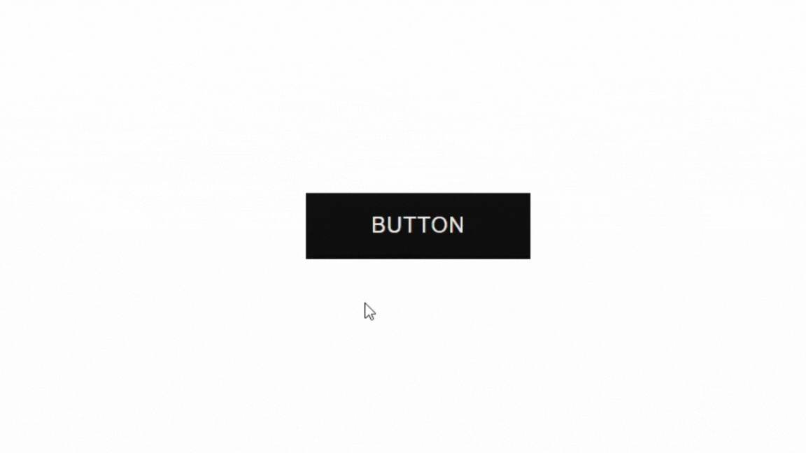
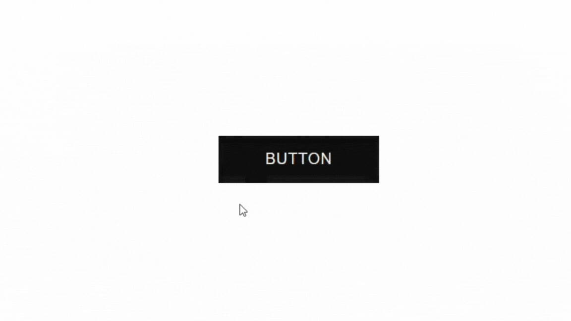
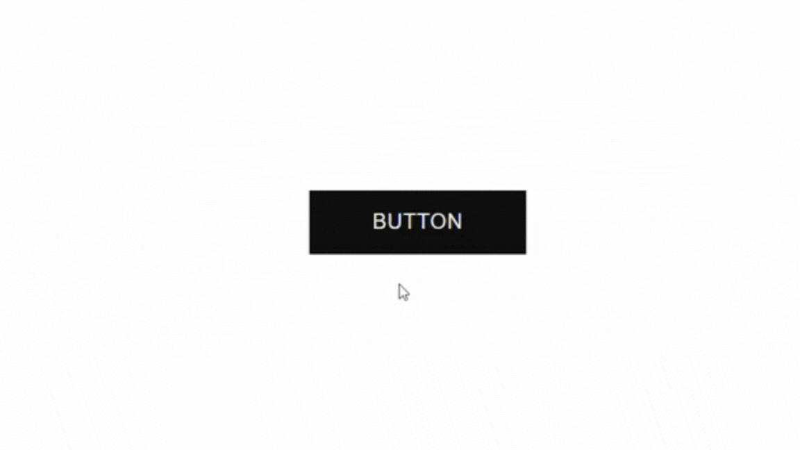
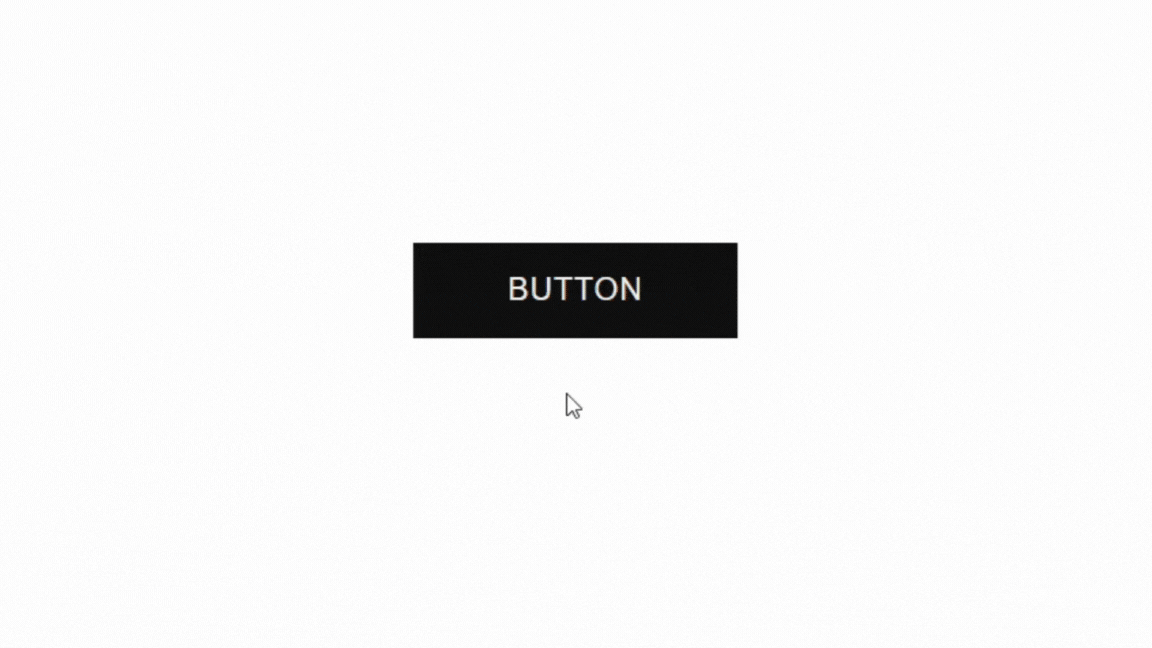
Button Demo
See the Pen Button Hover Animation by Kate (@kate_hg123) on CodePen.
HTML Breakdown
For our button, we can use the <button> element or the <a> element. Each element has different use cases.
Use Cases:
- Use the button element when: You need a clickable element to trigger an action, like submitting a form, triggering JavaScript functions, or performing any action within the webpage.
- Use the anchor element when: You need to create hyperlinks for navigation, whether it’s within the same webpage or linking to external resources.
To sum it up, choose the button element when you need an interactive element to trigger an action, and use the anchor when you need to create hyperlinks for navigation.
HTML Code using the anchor element
<a href="#" class="custom-btn" role="link">BUTTON</a>To create a link visually styled as a button, we need to have the following attributes: href, class, and role.
- href: Defines the destination link. Replace the ‘#’ with your link or anchor.
- class: Defines the selector to target for styling.
- role: Defines the purpose of the element for accessibility technologies like screen readers.
Learn more about links here.
HTML Code using the button element
<button class="custom-btn" type="button">BUTTON</button>To create a button, we need to have the following attributes: class and type.
- class: Defines the selector to target for styling.
- type: Defines the type of button and its intended action. There are three types: button, submit, and reset.
Learn more about buttons here.
CSS Breakdown
To style our button, we need to target the element with the class selector we chose in the HTML. I’m using ‘.custom-btn’.
First, let’s create its normal state:
/* button in its normal state */
.custom-btn {
    display: flex;
    justify-content: center;
    align-items: center;
    position: relative;
    height: 56px;
    width: 190px;
    background: #111;
    color: #fff;
    font-family: "Montserrat",sans-serif;
    font-size: 18px;
    letter-spacing: 1px;
    border: none;
    transition: all 300ms;
}
Next, let’s create its hover state:
/* button in its hover state */
.custom-btn:hover {
  background: transparent;
  color: #111;
}
Now we need to create an ::after pseudo element:
/* button after */
.custom-btn::after {
  content: '';
  position: absolute;
  width: 100%;
  height: 100%;
  background-color: transparent;
  border: 3px solid #fff;
  transform: scale(1.1, 1.3);
  opacity: 0;
  transition: all 500ms;
}
Now we need a hover state for the ::after pseudo element:
/* button hover after */
.custom-btn:hover::after {
  transform: scale(1, 1);
  opacity: 1;
}
Lastly, we need an active state to create a visual indication that the button was clicked:
/* button active state */
.custom-btn:active {
  transform: scale(.9);
}
How to add the button hover animation in Elementor

To create this button in Elementor, I’m using the button widget instead of writing my own HTML code. We can write less lines of custom CSS by using some of the style settings available in the widget.
For this example, I’ve adjusted some of the properties to fit the styling of the web design, like the padding, background color, and hover background color property.
Step 1: Add the button widget to your canvas and give it some basic styling
Navigate to the button widget content tab:
- Change the CTA text
- Add the button link
Then, in the button widget style tab:
- Change the typography to match your website (font family, font size, weight, etc.).
- Choose the text color. I’m using #ffffff (white).
- Pick your background color. I’m using #111 (black).
- Set the border-radius to 0 if you want sharp corners.
- Add padding to increase the size of your button.
Lastly, in the button widget advanced tab:
- Change the align-self property to start, center, or end. I’m using start.
- In the CSS classes box, type in your class selector. I used ‘custom-btn’.
Now let’s write our code.
Step 2: Write the custom CSS in the WordPress customizer

You can also use the custom CSS area in the advanced tab of the button widget. I prefer keeping all my custom code in one place for better management.
In WP customizer navigate to ‘Additional CSS’
1. Create the normal state (how it looks on the page without any user interaction)
/* button in its normal state */
.custom-btn {
    position: relative;
    transition: all 300ms;
}
2. Next, create the pseudo-element in its normal state.
/* button after */
.custom-btn::after {
  content: "";
  position: absolute;
  top: 0;
  left: 0;
  width: 100%;
  height: 100%;
  background: transparent;
  border: solid 3px #111;
  opacity: 0;
  transform: scale(1.1, 1.3);
  transition: all 500ms;
}
3. Create the hover state for the ::after pseudo element.
/* button hover after */
.custom-btn:hover::after {
  opacity: 1;
  transform: scale(1, 1);
}
4. Lastly, create active state (how the button looks on the page when a user clicks on it).
/* button active state */
.custom-btn:active {
  transform: scale(.9);
}
Publish your changes.
Step 3: Checking for mobile responsiveness in Elementor

Lastly, we need to check our code for mobile responsiveness.
In the Elementor editor, adjust the width of your button for tablet and mobile view using Elementor’s responsive settings.
Final Thoughts
Feel free to use my code as is, or play around with the different properties to create a button that fits your website aesthetic. Experiment with the colors, adjust the transition speeds, and make it yours!
The beauty of CSS lies in its flexibility, allowing you to level-up your website templates to fit your brand identity.
Remember, if you encounter any challenges or have questions along the way, feel free to drop them in the comments below. I’d love to see your work, and I’m here to help!
Full CSS for Button Hover Animation in Elementor
/* button in its normal state */
.custom-btn {
    position: relative;
    transition: all 300ms;
}

/* button after */
.custom-btn::after {
  content: "";
  position: absolute;
  top: 0;
  left: 0;
  width: 100%;
  height: 100%;
  background: transparent;
  border: solid 3px #111;
  opacity: 0;
  transform: scale(1.1, 1.3);
  transition: all 500ms;
}

/* button hover after */
.custom-btn:hover::after {
  opacity: 1;
  transform: scale(1, 1);
}

/* button active state */
.custom-btn:active {
  transform: scale(.9);
}
My button was inspired by this button.


