Are you taking the DIY route for your Elementor website? Let’s level up your cookie-cutter template with an engaging CTA button animation.
In this post, I’ll walk you through a simple yet effective way to enhance your Elementor website by adding a custom button animation using CSS.
The best part? It’s easy and can be done with both the free and Pro versions of Elementor.
For this demonstration, I’m using the Free Elementor Plugin with the Hello theme
25 Best Font Combinations for Elementor Websites 
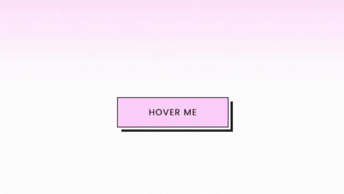
Button Demo
What is CSS?
CSS, or Cascading Style Sheets, acts like the design blueprint for your website. It allows you to customize the appearance of elements, like buttons, by defining their colors, sizes, and animations.
In our case, we’re using CSS to style a button, specifying how it looks normally on the page, what changes when someone hovers over it, and how it behaves when clicked.
For example:
/* Normal State */

.cust-btn {
    /* Property: Value */
    background-color: #3498db;
}
Here, we’re styling a button with the class ‘cust-btn’. Inside the curly brackets is the declaration that includes background-color (the property) and #3488db (the value). Each declaration ends with a semi colon.
Key Aspects of CSS:
1. Selectors are patterns that match elements on an HTML page. They allow you to pinpoint which elements you want to style.
2. CSS properties define the specific styling aspects you want to change, such as color, font size, margin, padding, etc.
3. Values are assigned to properties, determining how the styling should be applied. For example, a color property could have a value like “blue” or “#3498db.”
4. CSS syntax follows a straightforward pattern. Each styling rule consists of a selector, a declaration block enclosed in curly braces, and within the block, property-value pairs separated by colons and terminated with semicolons.
If you want to learn more about CSS, W3Schools is a great place to start.
How to Add a Custom Button Animation with CSS in Elementor
Step 1: Add the button widget to your canvas and give it some basic styling
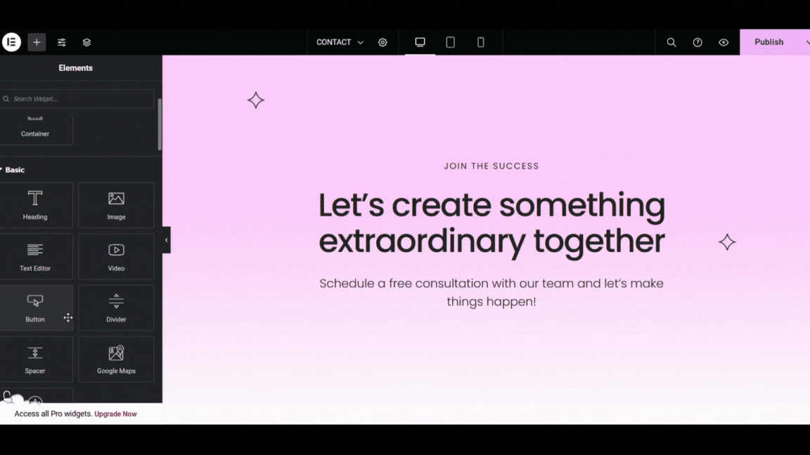
Navigate to the button widget content tab:
- Change the CTA text
- Add the button link
- Set the alignment to justified so the button takes up the full width of the container
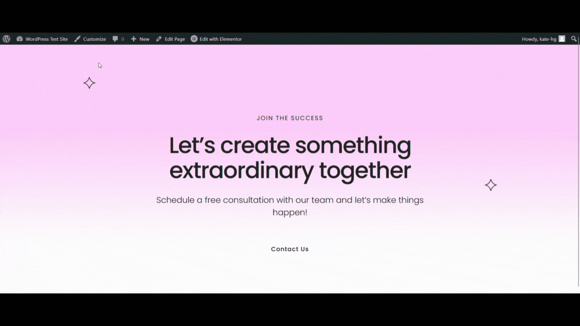
Next, in the button widget style tab:
- Choose typography to match your website (font family, font size, weight, etc.).
- Choose the text color and the text hover color. I’m using #212121 (black) and #ffffff (white).
- Set the background color to transparent. We will set the color later with our CSS code.
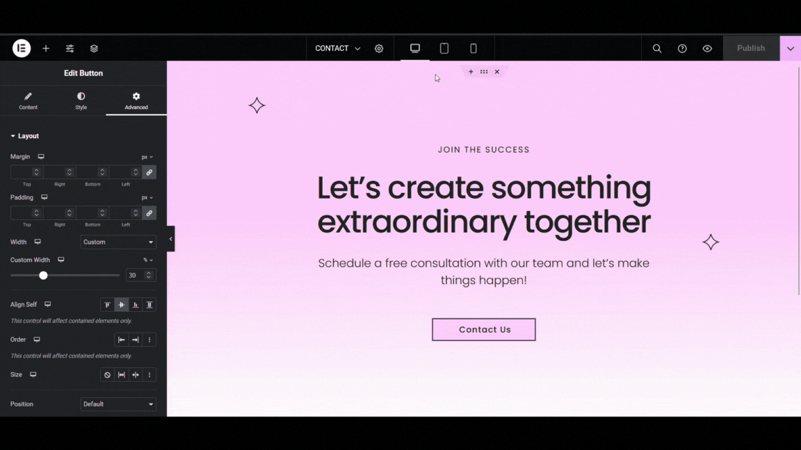
Lastly, in the button widget advanced tab:
- Change the width from default to custom.
- Set the width of your button and the placement. I used 30% width and align-self to center to match my page styling.
- In the CSS classes box, type in your class selector. I used ‘cust-btn’
Now let’s write our code.
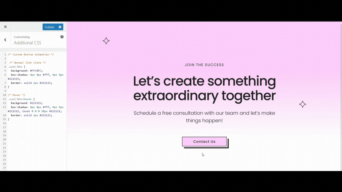
Step 2: Write the custom CSS in the WordPress customizer
In WP customizer navigate to ‘Additional CSS’
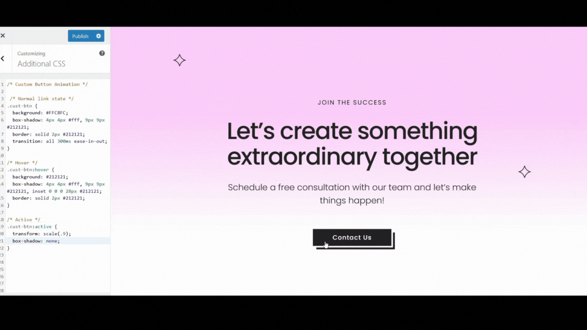
1. Create the normal state (how it looks on the page without any user interaction)
- Set the selector: .cust-btn {}
- Inside the curly brackets set the following properties: background, box-shadow, and border.
/* Normal link state */

.cust-btn {
    background: #FFC8FC;
    box-shadow: 4px 4px #fff, 9px 9px #212121;
    border: solid 2px #212121;
 }
2. Create hover state (how it looks on the page when a user hovers over the button)
- Set the selector .cust-btn with :hover
- Inside the curly brackets set the following properties: background, box-shadow, and border.
/* Hover */

.cust-btn:hover {
    background: #212121;
    box-shadow: 4px 4px #fff, 9px 9px #212121, inset 0 0 0 28px #212121;
    border: solid 2px #212121;
}
Here, we changed the background color to black and added an inset to the box shadow. The black inset creates a closing-in effect on the text when the button is hovered.
In order to see the inset effect we need to add a transition to slow it down.
Back up in the normal state let’s add the transition.
/* Normal link state */

.cust-btn {
    background: #FFC8FC;
    box-shadow: 4px 4px #fff, 9px 9px #212121;
    border: solid 2px #212121;
    transition: All 300 ms ease-in-out;
 }
There, now we can see the effect.
3. Create active state (how the button looks on the page when a user clicks on it)
- Set the selector .cust-btn with :active
- Inside the curly brackets set the following properties: transform and box-shadow.
/* Active */

.cust-btn:active {
    transform: scale(.9);
    box-shadow: none;
}
This code shrinks the button down and removes the box-shadow when a user clicks on it.
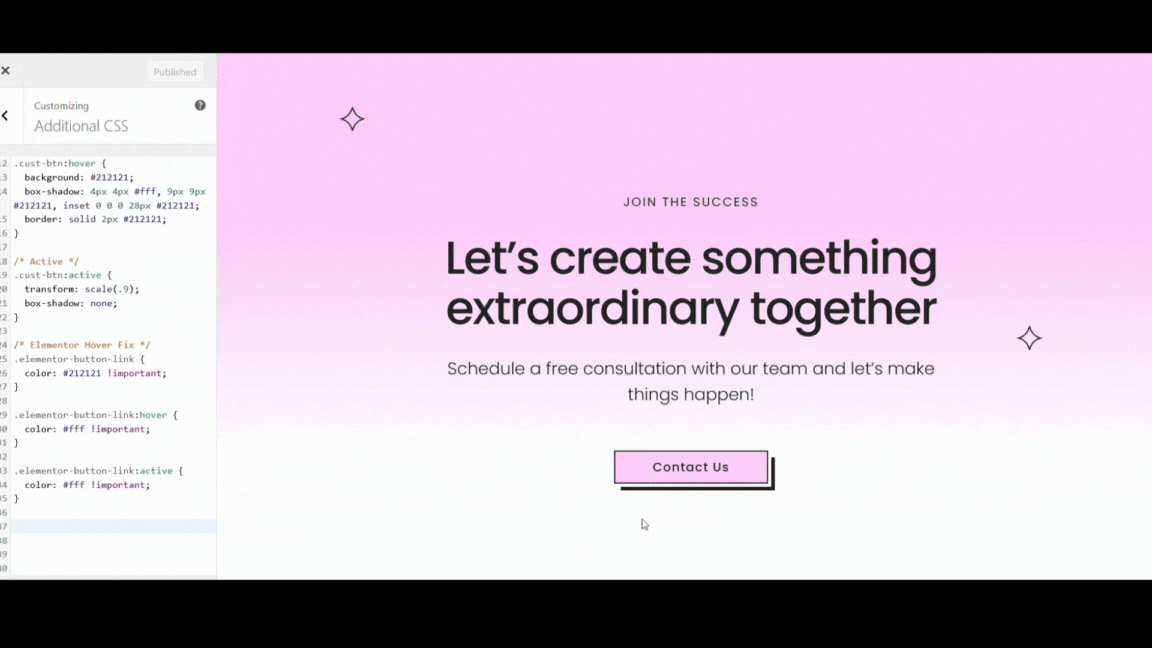
Step 3: Troubleshooting our code with Elementor
You’ll notice that when we click on the button, the text stays white, which is not the behavior we expect.
According to this GitHub ticket, it seems to be an issue with Elementor, and the workaround is adding the following code:
.elementor-button-link {
    color: #212121 !important;
}

.elementor-button-link:hover {
    color: #fff !important;
}

.elementor-button-link:active {
    color: #fff !important;
}
We need to target the elementor-button-link class for each state, then add the corresponding text color with ‘!important’.
Step 4: Checking for mobile responsiveness in Elementor
Lastly, we need to check our code for mobile responsiveness.
In the Elementor editor, adjust the width of your button for tablet and mobile view using Elementor’s responsive settings.
Final Thoughts
Feel free to use my code as is, or play around with the different properties to create a button that fits your website aesthetic. Experiment with the colors, adjust the transition speeds, and make it yours!
The beauty of CSS lies in its flexibility, allowing you to level-up your website templates to fit your brand identity.
Remember, if you encounter any challenges or have questions along the way, feel free to drop them in the comments below. I’d love to see your work, and I’m here to help!
Full CSS for Elementor Button Animation
/* Custom Button Animation */

 /* Normal link state */
.cust-btn {
	background: #FFC8FC;
	box-shadow: 4px 4px #fff, 9px 9px #212121;
	border: solid 2px #212121;
	transition: all 300ms ease-in-out;
}

/* Hover */
.cust-btn:hover {
	background: #212121;
	box-shadow: 4px 4px #fff, 9px 9px #212121, inset 0 0 0 28px #212121;
	border: solid 2px #212121;
}

/* Active */
.cust-btn:active {
	transform: scale(.9);
	box-shadow: none;
}

/* Elementor Hover Fix */
.elementor-button-link {
	color: #212121 !important;
}

.elementor-button-link:hover {
	color: #fff !important;
}

.elementor-button-link:active {
	color: #fff !important;
}

